
We are in a sophisticated yet well-personalised universe of information and technologies. The past decade has been a spike in tech optimisations and user experience studies than a gradual growth curve. Multi-channel to Omni-channel, commitment to developing better user experience and, more importantly, embracing narrative-driven storytelling as a critical component of user experience were some of the few benchmarks.
Content marketing 📝
In simple terms, content marketing is about offering engaging and helpful content that goes beyond your product value. Ultimately we expect these contents to help drive users through an intended journey. This is how it should be defined, but how it should be done or keep up with the evolution is something we can explore.
Does our fully-fledged 1500-word article, which we often call awareness or discovery level content, do the trick or get ignored with a quick 5-sec fast scroll? Or does it fulfil the user journey expectations we had in the beginning?
The business of making bite-sized content on the go 🏃
If you fast forward the evolution of the practical and creative content over the past 10 -15 years, even in the print industry, I have noticed that effort to make it compact and mobile has been taken up to severe consideration.
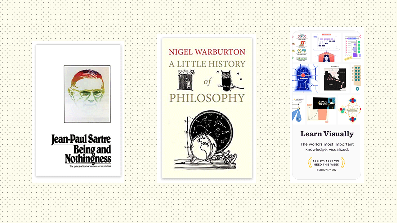
For example, suppose you want to skim through western philosophy but not drown yourself in hundreds of Wikipedia pages. In that case, there is an excellent paperback called "A little history of philosophy" from Yale Press. Written and structured by Nigel Warburton, the book covers western philosophy with exciting 40 sections.
"It's about how you compact the content.
Bringing the exciting narrative and setting up a reading path."
Well, not for a doctoral who wants to question reality and write something for the next journal, but for people like me making a nomad journey among the thousands of other things, this handy beige colour paperback is something. This is just one example. There are thousands of publications like this. Even Yuval Noah Harari's lineup is something similar to this. They have compacted, narrative-driven content just for us who struggle with productivity but still starve for information to keep up.
So what's the inspiration? It's about how you compact the content—bringing the exciting narrative and setting up a reading path. Our article can still contain 1500 words, making it digestible without 30min high of concentrated reading time.
Ah, the delights! 🍬🍬
We now know our same old four-page word article does not do much, even if you have it under your content mapping structure. We should make it compact. But there's more.
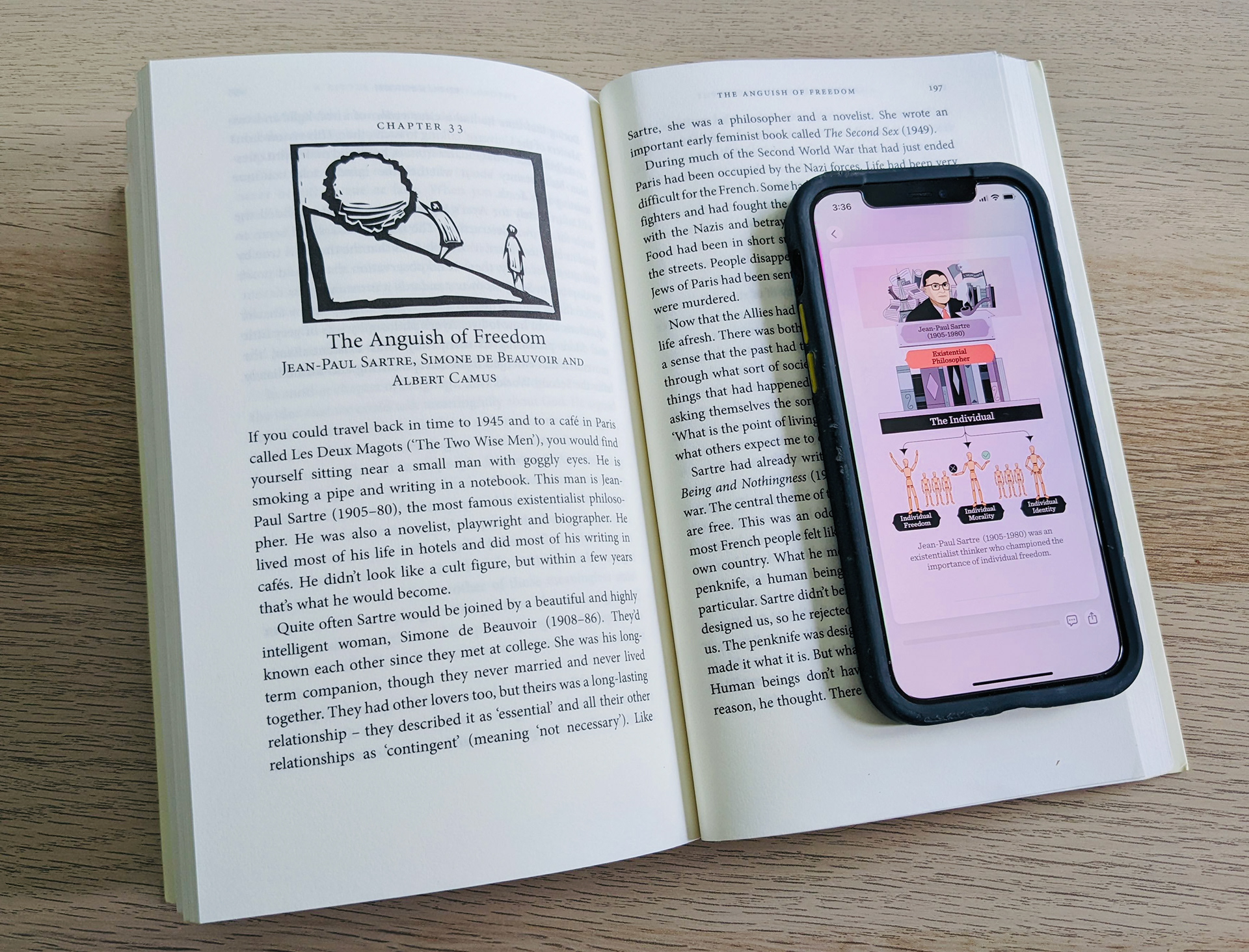
Take a look at Lucid. It's an intelligent application that has taken several steps ahead of these content optimisations. And they have unique yet straightforward illustrations to guide us; guess what? It's less than 30 words per viewport most of the time.
As above, I am taking the same example.
In Warburton's book, you will find Jean-Paul-Sartre in the 33rd section and have a basic idea of existentialism in a few pages. So when it comes to Lucid, It's just three quick pop over sliders with well-illustrated infographics. The beauty here is not the technology but the understanding of the context.
"The satisfaction of acquiring the same information set in
different forms remain almost the same."
Now, look at the big picture, how technology has evolved, being academic legacy literature somewhere in the library's scholars' section and then become a 15-sec quick read at your fingertips. Well, I believe it's not technology. How we understand the user experience in any given context is improving over time.
We consume these two contents differently, from the ambience, interactive time, and even your seating position to ergonomics. Three quick taps will take you through the key pillars of existentialism by Sartre while you are in the supermarket queue. The best thing is that the satisfaction of acquiring the same information in different forms remains almost the same. Sometimes even better with optimised content ( like Lucid)
It's not just the content here. It's the effective use of simplified illustrations. It is well-equipped with metaphors and symbols; it teaches us that we can do way more than too-literal illustrations or just a royalty-free photograph as breakers to optimise lengthy articles.
So, the collaboration-wise experience designers should play a significant role here, translating sophisticated articles into small digestible pieces of content. And more importantly, to make it super decodable, they should have well-thought illustrations and interactive designs that ensure users follow each step.
Takeaways
• Content (marketing) today should provide helpful, engaging, and delightful driveways to ensure a successful user journey.
• Context matters, good use of language alone won't help. Therefore bringing experience designers to the table adds enormous value to your content/article implementations. They make the driveway delightful, pleasant and informative throughout the journey.
And I am sure when we make it to the destination, it will create positive impressions about the journey and guaranteed returns.