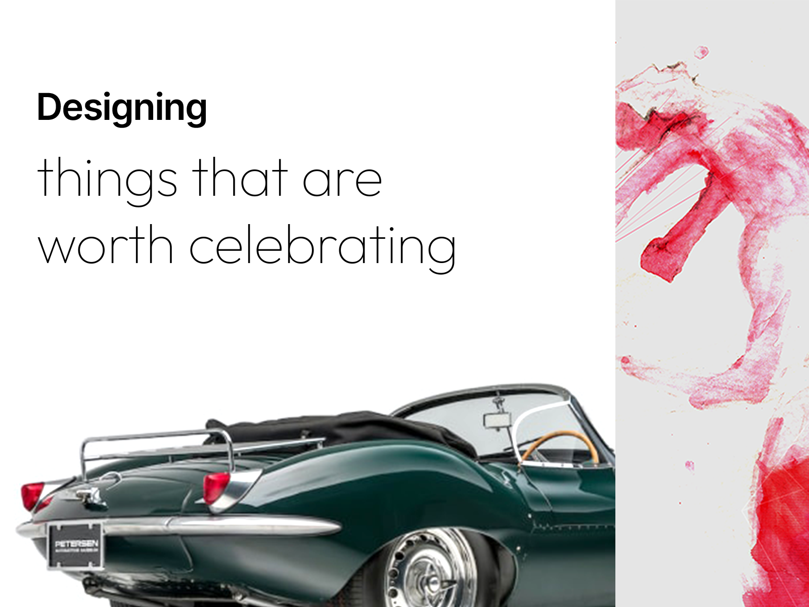
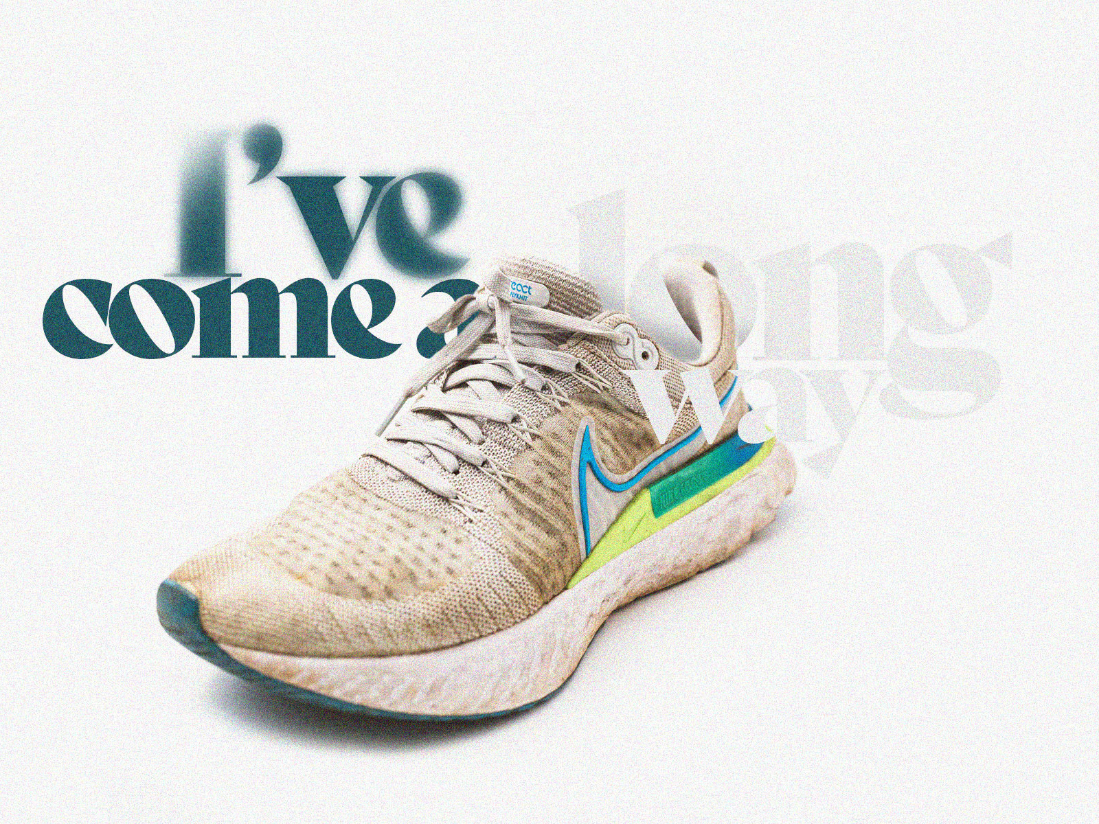
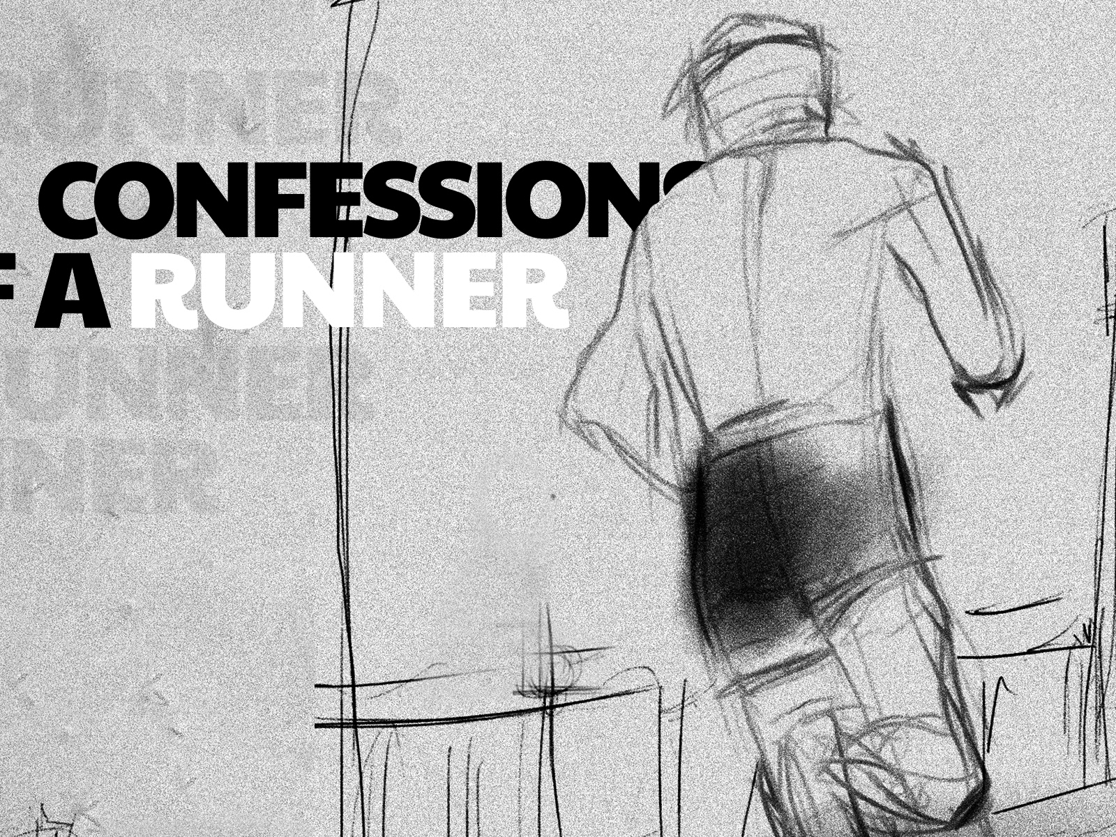
Story illustrations are aspirational and immersive - An early tryout from my recent project 

For the last couple of months, my work has focused heavily on one specific digital visual communication design area called a comprehensive guide for illustrations. I am sharing my experience here with crucial benchmarks and technicalities. 
I hope UI designers, Digital designers or Product designers actively working on system designs find different parts of this article helpful to their ongoing work.

How it started
Back in 2020, I started working on a design system. The requirement was to facilitate product designers with suitable and flexible components while maintaining consistency. Planning and working with a design system is a continuously evolving task as a project. Besides understanding the requirement, precise documentation and design for scalability are vital in such work.

Throughout my involvement in this project, I have repeatedly noticed that some of our info-heavy screens ( Snippets ) need support to communicate messages effectively and, most importantly, delightfully. Because we all know there's a limit to making our components stylish and modern in large organisational products. Our component libraries were starving something more than text or text-based icons, components and elements. In broad terms, we lacked a visual catalyst, "Illustrations in UI". 
Based on task prioritisations, we managed the problem by working with our existing icons, but we knew we needed a more reliable and sustainable method to address this problem.  

Problem with stock illustration libraries 
The term "Illustrations" is a blanket term for many digital designers. With the recent uplift of UI illustrations libraries and figures, the usage of these visual supporters has skyrocketed in every digital product. But I needed help finding precise categorisation for these stock illustrations. Either they are simple modules ( human or props ) or large illustrations that are difficult to plug into your ideal requirement.  
I assume Midjourney or Dall.E2 may address this in the future 😉 But let's leave that for the moment. 

Image from www.drawkit.com

When do we need illustrations? 
See below for my comparison of when and why we need illustrations over photographs. However, there are compelling examples of fusion work for spot-level and module-level illustrations on creditkarma.com if you want to break some boundaries in vector-based elements. 

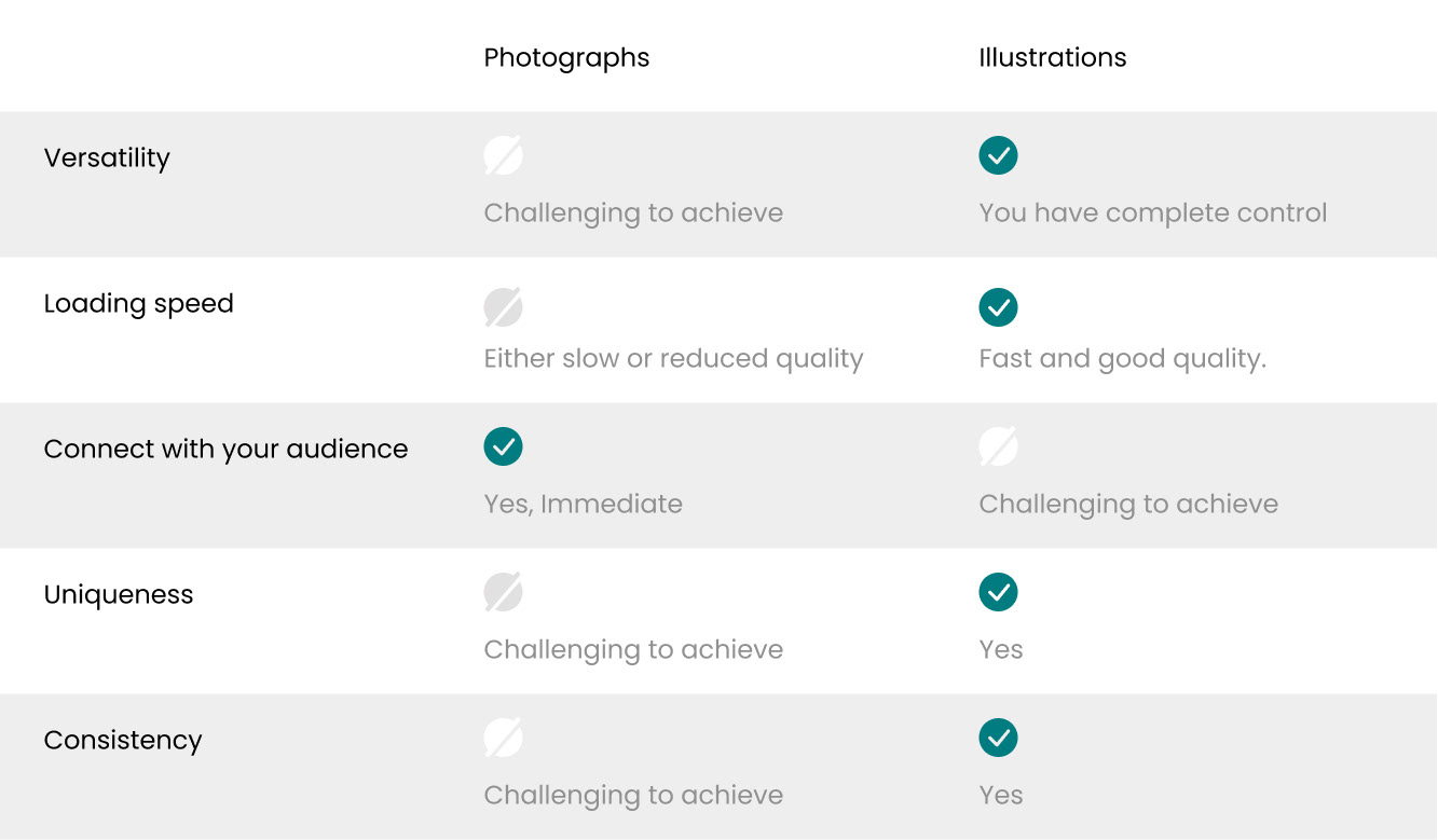
When do we need/use illustrations? - Photographs vs Illustrations 

The planning of the illustration design 
Since we had a complete monochrome icon library to facilitate up to 32px visual support, our ideal illustration system should support anything above that. I have created three main buckets to categorise the illustrations based on their size and usage.
Then started from Spots and built from there.
1. Spot Illustrations
• Smallest in the category. 
• Has a max size limit of 130x130px.
• Can use multiple on a page.
• Support your error/empty modals, and scenarios with text. 

2. Module Illustrations
• Mid-size illustrations ( Larger than spots )
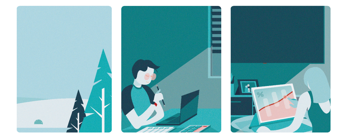
• Block components of story illustrations.
• Can use multiple on a page.
• Help you to portray product features and loop animations.

3. Story Illustrations
• Largest in the category.
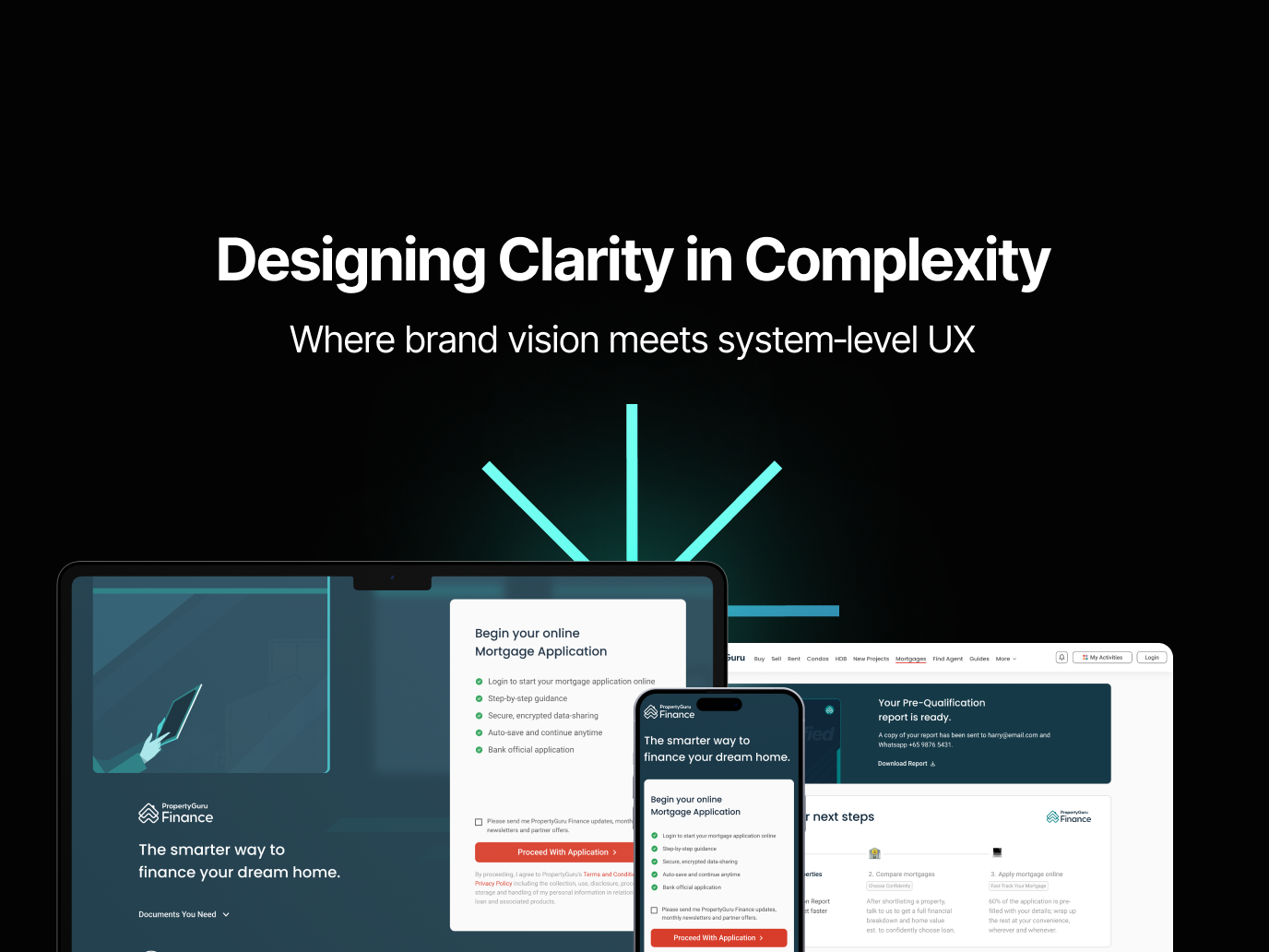
• Immersive and takes full page width.
• Recommended - one per page - mostly mastheads or mid-page visual breakers. 

Setting guides for Module and Story illustrations 
Every company and product has its core brand guidelines and principles. These are solid verticals that help maintain the organisation's level of consistency in communication. In my case, I have anchored my core principles to the company brand principles, which are briefly listed here as,
Transparent (To make illustration authentic as much as possible, real scenarios, places, 
people and behaviours)
Simple (Simple actions, forms and previews of illustrations)
Smart ( The perfect blend of tech and aspirations and addressing changing behaviours) 

How does the scaling work?
Three pillars of forming ( designing ) illustrations
Illustration design methodology

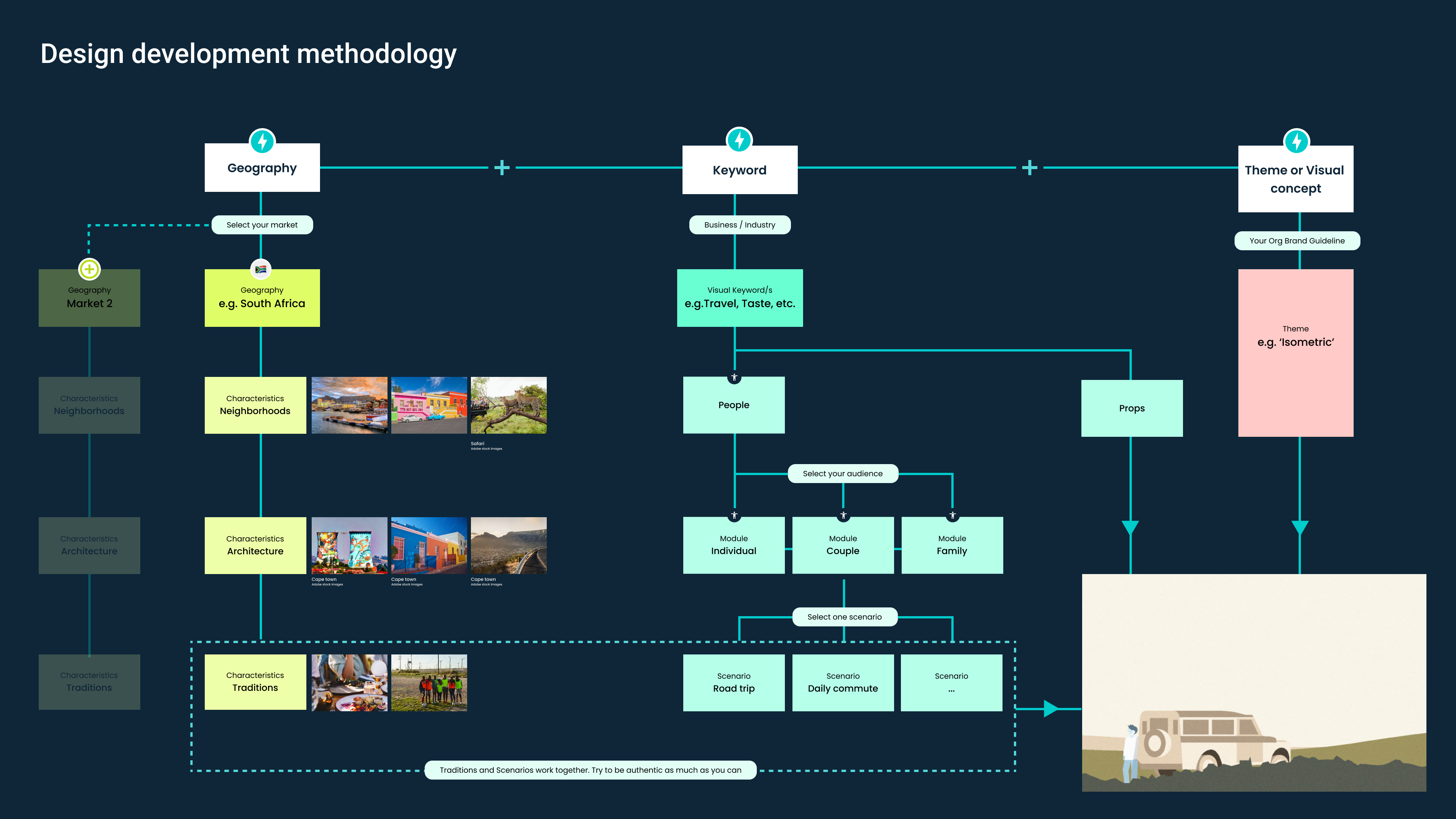
Design development methodology for system based illustration library

1️⃣  Geography
This is where you can localise your props; In my case, this was 🇸🇬 Singapore. When the product expands, you can add branches to regional localisations.

Geographical localisation of illustrations - Singapore specific props 

2️⃣  Keyword 
This is your business/ industry vertical. You can include archetypes of your target audience here. This will help you to personalise the illustration.

3️⃣  Theme or visual concept
Connect to your master guideline ( Colour palette/ visual concepts/ etc.). Most organisations define this inside their brand guideline; if not, finalise one with a comprehensive reference study. 


Let's talk about ingredients now; Colours first. 

Use of colour in art & illustrations ​​​​​​​

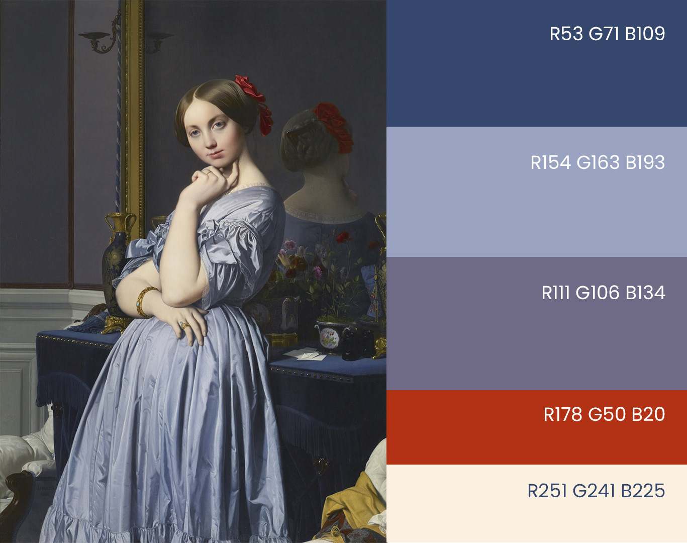
By Jean Auguste Dominique Ingres - gQGTMTaShUJNKA at Google Arts & Culture, Public Domain, https://commons.wikimedia.org/w/index.php?curid=13466213

Colour in art is widely described as perfectly designed palettes to draw our attention to the hues that have the most significant impact. 
Comtesse d'Haussonville has a limited palette of deep indigo to lavender with brilliant vermilion, bringing out the outspoken and independent personality with hints of seduction and intrigue. A carefully selected limited palette can portray a strong sense of character and solid messages. Jean-Auguste-Dominique Ingres did this in 1845. 

I only proceeded with a partial-on brand palette when forming most of my illustrations. Because guided designs need design discipline, start small with limits to help you scale up precisely and fast.  
Start monochrome and slowly grow your palette in illustration systems up to a single-digit closed palette. 
These are not one-off illustrations; the idea is to create a consistent library of branded digital illustrations. When your team grows, it's easier to adjust if your palette has limited colours. So even if your organisation branded palette has a full wheel of colours, let's start small and improve from there. 😀
Colour palette

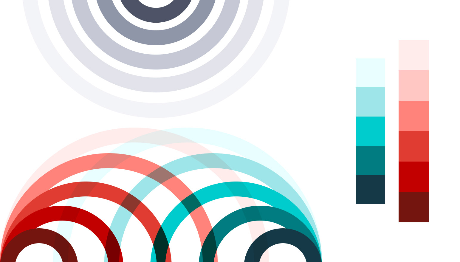
Limited hues make your illustrations more consistent and adjust - My palette for a recent collection

Form and detailing 
Closely knitted to the concept and theme, form and detailing create the illustration's overall look and feel. From hyper realistic modules to minimal flat vectors, your illustration style can be carefully selected based on the master theme.
Mine is light and shadow that creates the form of perspectives. We can define it as isometric illustrations. ​​​​​​​

Module illustrations are simple but key ambassadors of your detailing style

However, I've maintained simple house rules, such as
a. Maintaining a single light source throughout the illustration.
b. Strong metaphors as props. 
c. Low fidelity on modules, High fidelity in stories. 


Humans, flora and fauna 
Designing live figures is the most time-consuming part of the illustration systems. This task will check your ability to life-drawing to the limits. 
Expressions of poses and ethnic features of humans are critical regarding the product and brand relatability. 
flora and fauna illustrations

People and environments in illustrations

Framing and composition 
No illustration achieves its harmony without proper composition. Asymmetric, symmetric or golden ratios make the final cherry on top of your art piece. ( I called it art since you are creating art here, there is no separate category called UI illustration when it comes to custom digital pieces) 

Set up lockup ratios according to your product context ( web page / App / Mobile implementations ). Those ratios can be one or few from the following significant ones.
1:1 - Versatile and easy to places
1:2 - Compact container works best with stacks
4:3 - Maximise the content area and well-established frame. Works with inline groups 
16:9 - Modern and highly custom. Singles work best​​​​​​​
frames and ratios

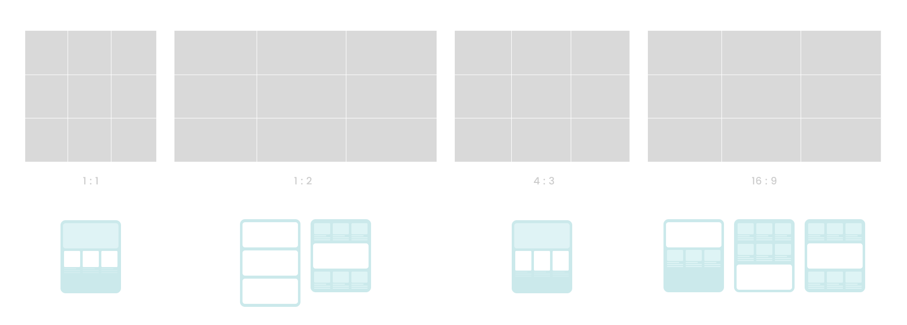
Ratio and frame define the placement of your visual representation.

Exports and tools

Most of my illustrations began their skeleton forms in Adobe Illustrator. Illustrator still has the most flexible pen handling and can efficiently deal with diagonal strokes in advanced figures. 
Figma, on the other hand, helps to simplify your colouring techniques and validate the palette methodology with the standards. I recommend something different than the pen tool in Figma, but it will do the simple symmetries regarding larger forms.​​​​​​​
Adobe After Effects-Adobe Illustrator, Figma logos

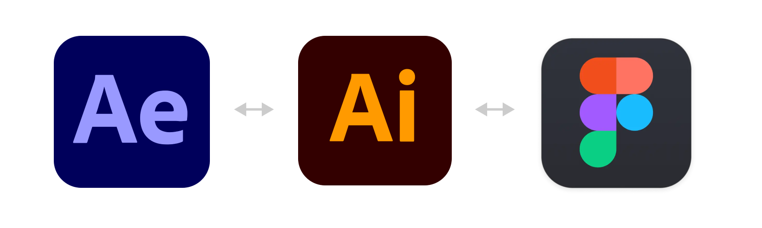
AE and AI work smoothly for animated illustrations while AI and Figma collaborate best for statics illustrations.

My practice always has been Adobe to Figma, so the final export comes from Figma with ( SVG, jpg/pngx1,..X2,..X3) based on the platform.
(ex: most of the email imagery content still does not support SVG, so make sure you enable jpg/png as well )
However, if you are planning to animate any of your illustrations, Adobe Illustrator works best with After Effects compared to Figma outputs. 


Takeaways 

Designing an illustration library or system is essential to maintain a consistent visual personality throughout your UI. Based on my experience, the following pointers are critical from the above exercise.

1. Approach the illustration task via categories ( Based on the size, behaviour, usage, etc.) This will help to scale up your system.
2. Start from the smallest or most straightforward form.
3. Connect to your core brand identity; it helps to blend in with page colours and other visual elements. 
4. Set clear colour and form guides and strictly stick to them.
5. Set fixed frames.
6. Pick the right tools to build and export. ​​​​​​​
Singapore HDB Illustration family

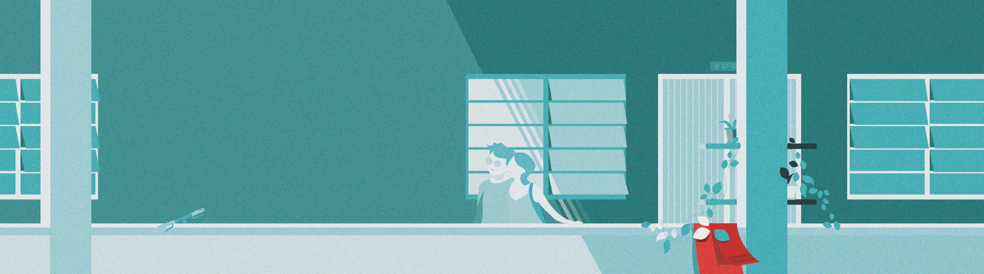
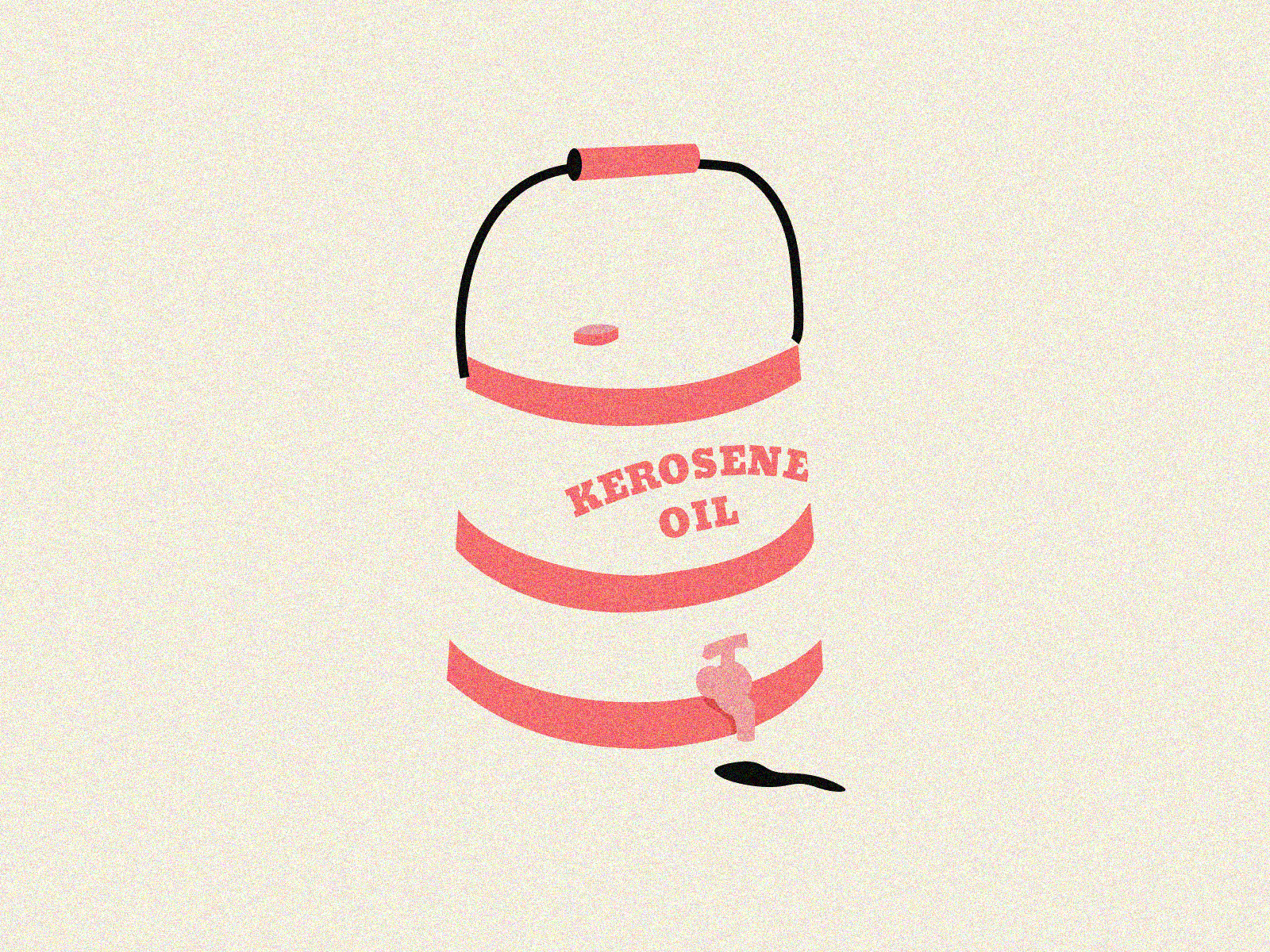
Story Illustrations are immersive and full-width. Personalised the story I worked on www.propertygurufinance.com

Unlike design systems or component libraries, illustration design systems in UI must play a balanced role in standards. Illustration system design should be geared to scale up and be precise with ingredient usage so designers with different disciplines can follow the guide rails.

Possible limitations and challenges 

UI illustration guides have challenges like any other system and guide designs. 

• Less autonomy for artist-level creativity.
• Strict guides may only please some stakeholders in the long run.
• Frequent monitoring or overseeing is needed to flag derails. 

I have added most of the critical points I encountered during the process.
I am happy to talk about points I have missed or areas you think I should know of over a coffee if you are in Singapore 🇸🇬 ☕️. 
​​​​​​​

You may also like

Back to Top