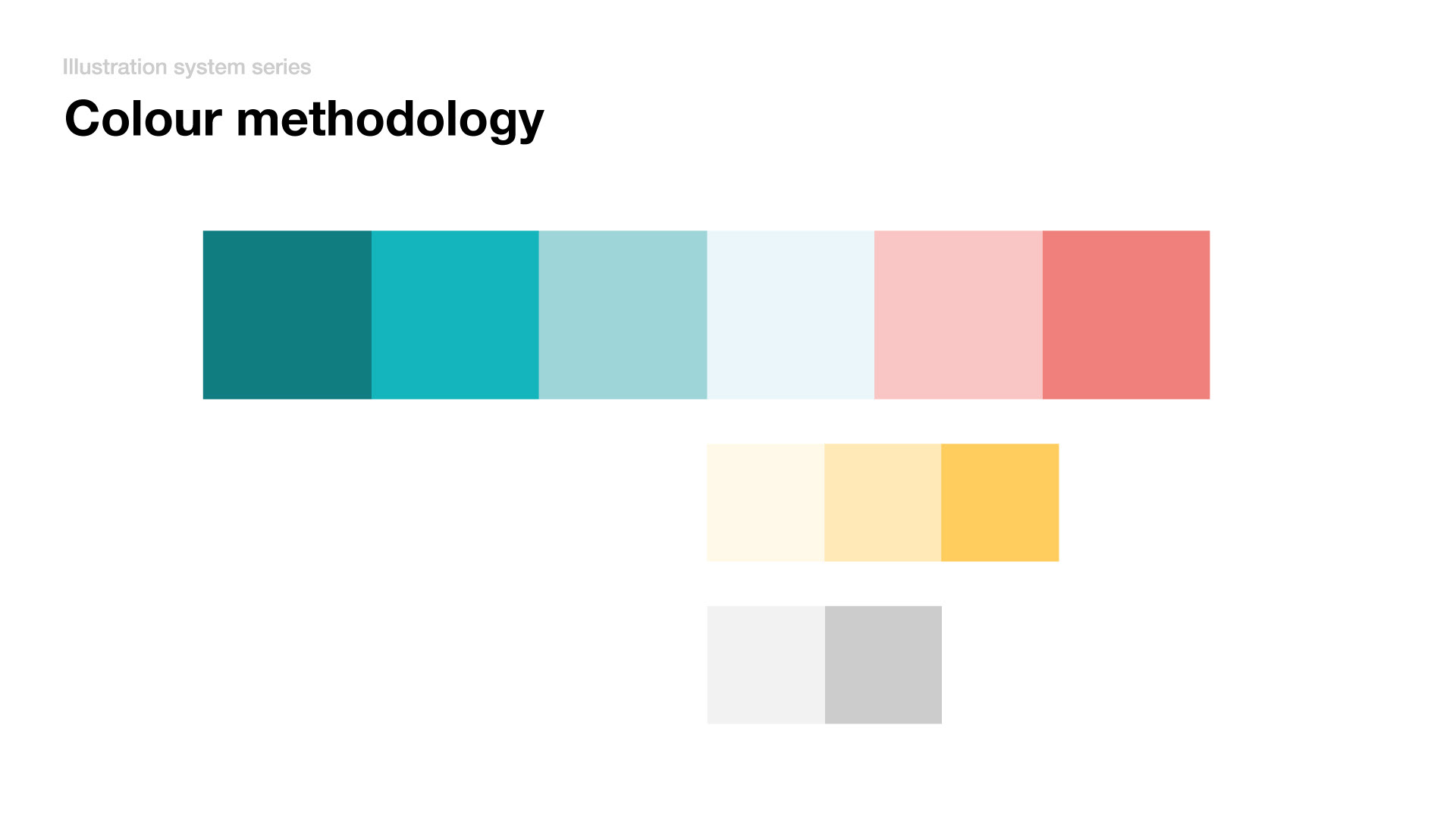
The illustrations follow accents of primary brand colours, which helps them blend in with content instead of making contrast images against the core content of the context.
E.g. CTA and Key content should be prominent and legible.
The rest of the supportive content should support this. Making unnecessary colour polarisation means we are complicating the overall message.
E.g. CTA and Key content should be prominent and legible.
The rest of the supportive content should support this. Making unnecessary colour polarisation means we are complicating the overall message.

